

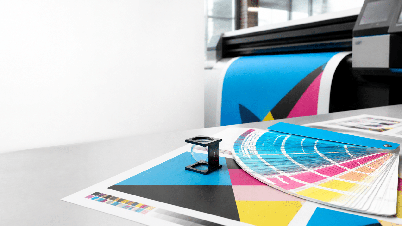
Pantone Color System (PMS): Digital & Large-Format Printing Guide
The Pantone Matching System (PMS) is a standardized color-reference system used by designers, manufacturers, brand managers, and commercial printers. People often use “Pantone,” “PMS,” “Pantone color,” and “PMS color” interchangeably. More specifically, PMS refers to the Pantone Matching System: a way to identify a particular color by name and number.
For example, Pantone 185 C and Pantone 286 C identify specific target colors. The shared PMS number helps a client, designer, and printer discuss the same intended brand color instead of relying on descriptions such as “bright red,” “navy blue,” or “teal.”
In traditional commercial printing, a PMS color may print as a spot color—a dedicated, pre-mixed ink printed separately from standard CMYK process inks. That can improve consistency and can reproduce certain colors that standard CMYK may not reach, including selected highly saturated oranges, greens, blues, metallics, and fluorescents.
Pantone and PMS terms designers should know
| Term | Meaning | Why It Matters |
|---|---|---|
| Pantone / PMS | A standardized color-reference system | Defines a clear target for brand color |
| Pantone Matching System | The full meaning of PMS | Clarifies that “PMS color” usually means a Pantone-specified color |
| Spot color | A dedicated, pre-mixed ink or named color channel | May achieve a closer match than CMYK for a selected color |
| Process color | A color built from cyan, magenta, yellow, and black inks | Used for most full-color commercial printing |
| Pantone C | A Pantone reference intended for coated paper | Usually appears brighter and more saturated on coated stock |
| Pantone U | A Pantone reference intended for uncoated paper | Often appears softer because uncoated paper absorbs more ink |
| Color gamut | The range of colors a device or process can reproduce | Determines whether a requested PMS target can be matched closely |
Why Brands Use Pantone and PMS Colors
Brands use Pantone and PMS colors when a signature color needs to remain recognizable across many printed pieces, campaigns, offices, vendors, and locations. A documented PMS number provides a much more reliable starting point than a screenshot, an RGB value, or a verbal description of color.
Common applications include:
- Corporate logos, letterhead, envelopes, and stationery
- Business cards, presentation folders, brochures, and annual reports
- Retail packaging, product inserts, and point-of-sale materials
- Brand-sensitive catalogs, booklets, and sales kits
- Event graphics, sponsor walls, and trade-show displays
- Signage, decals, window graphics, wall murals, and branded interiors
- Franchise, retail, hospitality, fashion, food, and consumer-product branding
For example, a company with a recognizable orange logo may specify one PMS color so its stationery, product packaging, trade-show graphics, and marketing collateral all begin with the same approved target color—even when the finished pieces use different printing processes.
PMS vs. CMYK, RGB & HEX
The most important production distinction is PMS vs. CMYK. PMS is a standardized color specification, while CMYK is the four-color process used to create most full-color printed materials. RGB and HEX are primarily used for screens and websites.
| Color System | What It Means | Best Use | Main Limitation |
|---|---|---|---|
| PMS / Pantone | Pantone Matching System; a standardized named color target | Brand colors, logos, spot-color printing, and color specifications | Not every PMS color can be matched exactly by CMYK, digital, or inkjet equipment |
| CMYK | Cyan, magenta, yellow, and black process inks | Photos, gradients, brochures, catalogs, and most full-color print jobs | Some bright PMS colors are outside the available CMYK gamut |
| RGB | Red, green, and blue light | Monitors, phones, websites, social media, and digital advertising | RGB screen brightness cannot be duplicated directly with printed ink |
| HEX | A six-digit web value based on RGB, such as #00AEEF | Web design, user interfaces, email, and online brand guidelines | A HEX value is not a physical print-color specification |
For example, #00AEEF appears bright on a screen because displays emit light. Print uses reflected ink on paper, vinyl, fabric, or board, so its CMYK conversion may appear less luminous. Before submitting artwork, review our Print Production Guide & Prepress Checklist.
Can Digital Printing Match PMS Colors?
Yes. Pantone colors in digital printing can often be reproduced very closely, but most digital presses simulate a PMS target with CMYK or expanded-gamut inks rather than printing a traditional dedicated Pantone spot ink.
Digital press RIP software translates a live Pantone swatch into the best available combination of inks. If the requested PMS color falls inside the selected press, paper, and profile combination’s printable gamut, the result can be an excellent visual match. If the color is outside that gamut, the printer will produce the closest achievable result.
Digital City Printing’s HP Indigo 15K digital printing service uses expanded-gamut HP IndiChrome Plus inks, including orange, violet, and green in addition to CMYK. That extended ink set can emulate up to 97% of the physical Pantone range, making it a strong option for many brand-sensitive short- and medium-run projects.
When PMS digital printing is a good fit
- Short-run brochures, sales sheets, and marketing collateral
- Corporate presentation books, pitch decks, and reports
- Personalized and variable-data marketing campaigns
- Product prototypes and packaging mockups
- Fast-turnaround catalogs, manuals, and booklets
- Brand colors that fall within the selected digital press gamut
PMS Printing Limitations in Digital Printing
Digital PMS simulation can be highly accurate, but it is not identical to printing a dedicated spot ink on a conventional offset press. Consider these limitations before production:
- Out-of-gamut colors: Some highly saturated PMS colors cannot be recreated with the available digital ink set.
- Metallic PMS colors: Standard CMYK and most digital inks cannot reproduce the reflective particles in true metallic ink.
- Fluorescent PMS colors: Neon and fluorescent targets often fall outside standard digital-print gamut.
- Paper changes the result: Gloss, matte, uncoated, textured, colored, and synthetic materials affect ink absorption and light reflection.
- Screen previews are not contract proofs: Monitor brightness, RGB settings, calibration, and room lighting can make on-screen color misleading.
- Design effects can trigger conversion: Transparencies, shadows, blending modes, and opacity effects can convert a PMS element into process color.
For brand-critical print, request a physical proof or production test before approving a full run.
PMS Large-Format Printing: What to Expect
Pantone large-format printing can reproduce many branded colors very well, but wide-format equipment usually does not use true PMS spot inks in the same way as conventional offset printing.
Large-format inkjet printers build color using CMYK and, depending on the printer, extra channels such as light cyan, light magenta, orange, green, violet, light black, and white. These inks expand the available gamut and improve tonal transitions. However, the PMS color is still reproduced as a material-specific, profile-based inkjet simulation.
This applies to large-format posters, vinyl banners, window graphics, wall murals, step-and-repeat backdrops, trade-show displays, fabric graphics, decals, and retail signage.
Large-Format PMS Color Limitations
1. Inkjet printers simulate PMS colors
Wide-format inkjet printers build a requested PMS target from their available ink channels. Even an expanded-gamut inkjet printer cannot reproduce every Pantone formula exactly. The final result depends on the printer, ink configuration, RIP settings, media profile, and calibration.
2. Material changes PMS color matching
The same PMS logo can look different on gloss vinyl, matte vinyl, fabric, mesh banner, foam board, clear vinyl, backlit film, uncoated poster stock, acrylic, or another rigid substrate. Gloss surfaces reflect more light, fabric texture softens detail, and uncoated media may reduce saturation.
Clear vinyl requires special consideration. Because CMYK inks are translucent, a white-ink underlay may be needed to keep the color strong and readable. Use our commercial print-file preflight checklist for guidance on white ink, bleed, resolution, safe areas, and production-ready files.
3. Lighting affects perceived color
Color can appear different in daylight, under office LEDs, in warm retail lighting, at an event venue, or when backlit. When color is critical, review a proof under lighting conditions similar to the final installation environment.
4. Saturated hues can be harder to match
Bright oranges, vivid reds, electric blues, strong violets, and intense greens can be difficult to simulate. Whether a PMS target is achievable depends on the Pantone number, printer, ink set, substrate, profile, and finish.
5. Metallic and fluorescent PMS colors need specialty solutions
A CMYK gray gradient can suggest a metallic appearance, but it cannot create the reflective quality of metallic ink or foil. Fluorescent PMS colors require specialty fluorescent inks, neon material, or another approved method. Discuss these requirements before finalizing your design.
6. Viewing distance affects large-format production
Large-format graphics are normally viewed farther away than brochures or business cards. A banner may use 100–150 DPI at final size, while close-viewed commercial print is commonly prepared at 300 DPI. The goal is a crisp, effective graphic at its intended viewing distance.
Should You Use PMS or CMYK?
The best choice depends on brand requirements, job quantity, budget, material, finishing needs, and the selected printing process.
| If Your Project Needs… | Best Starting Point |
|---|---|
| A brand-critical color that needs close control | PMS specification with proofing and a production consultation |
| High-volume production with dedicated spot inks | Offset printing with specified Pantone or PMS spot ink(s) |
| Short runs, rush turnaround, variable data, or versioning | Digital printing with PMS color simulation |
| Posters, banners, backdrops, and event signage | Wide-format printing with material-specific PMS conversion and proofing |
| Metallic shine | Foil, metallic substrate, or a specialty finishing process |
| Fluorescent or neon color | Confirm specialty ink or media options before designing |
| Website, social, and email graphics | RGB/HEX for screens; create a separate PMS or CMYK version for print |
How to Prepare PMS Files for Printing
- Choose the correct Pantone library. Use Pantone Solid Coated for coated stock and Pantone Solid Uncoated for uncoated stock.
- Use one consistent PMS swatch name. Duplicate swatches with slightly different names can cause unexpected separations or conversion issues.
- Keep the Pantone swatch live while color approval is pending. This allows the production team to assess the requested PMS target before conversion.
- Convert RGB files intentionally. For conventional CMYK production, convert RGB photos and artwork using the proper print workflow before submission.
- Use vector logos and line art. AI, EPS, and vector PDF files remain sharp from business-card size through large-format displays.
- Use caution with transparency and effects. Shadows, blending modes, and opacity can convert a PMS element to process color.
- Supply a press-ready PDF. PDF/X-4 is often a good format for preserving vectors, fonts, profiles, and transparency.
- Specify the substrate and finish. Include the material, coating, final size, intended viewing conditions, deadline, and whether proof approval is needed.
Before submitting files, review the Digital City Printing Print Production Guide & Prepress Checklist. It covers color mode, resolution, bleed, trim, safe areas, fonts, linked assets, and common prepress requirements.
PMS Printing and Color Matching in NYC
Need help with Pantone color matching for digital, offset, or large-format printing in NYC? Digital City Printing can review your Pantone- or PMS-directed files, recommend the most practical production method, and help determine whether your target should use a dedicated spot ink, expanded-gamut digital simulation, or a material-adjusted wide-format conversion.
For an accurate production review, include your Pantone or PMS number, whether it is coated or uncoated, final size, quantity, material, finish, deadline, and whether a physical proof is required. We can help with color-sensitive brochures, catalogs, posters, banners, branded displays, and other commercial printing services.
Life-Size Cutout Sizer & Proofing Studio
Upload your photo to test scale, board fit, and DPI. Use the controls below or drag on the board to position. Areas falling outside the board will be dimmed.
Select Board Size
Position & Proportions
Tip: Click & drag image on canvas to reposition.
Live Production Stage
This tool provides an automated digital visual reference only. All uploaded files undergo review by our in-house pre-press graphics team prior to printing. Final determination of image sharpness, cutout contour line feasibility, easel placement, head-to-body scaling, and board stability will be confirmed during manual prepress inspection. If your file does not meet commercial large-format production standards, our graphics department will contact you with proofing options before manufacturing starts.
Frequently Asked Questions : Pantone and PMS | FAQ

Q: Is PMS the same as Pantone?
Answer: In most printing conversations, yes. PMS means Pantone Matching System. People may say “Pantone color,” “PMS color,” or “Pantone number” when referring to a standardized Pantone color specification.
Q: Is PMS printing the same as spot-color printing?
Answer: PMS printing often refers to spot-color printing with a dedicated Pantone-matched ink. A PMS color can also be simulated on a digital press or wide-format printer. In that case, the equipment builds the closest possible visual match from its available inks rather than using a true pre-mixed spot ink.
Q: What is the difference between PMS and CMYK?
Answer: PMS identifies a standardized color target, while CMYK uses four process inks—cyan, magenta, yellow, and black—to build color. A CMYK conversion can approximate many PMS colors, but certain bright, metallic, fluorescent, or highly saturated PMS colors cannot be duplicated exactly in standard CMYK printing.
Q: Can digital printing match PMS colors exactly?
Answer: Sometimes, but not always. The result depends on the PMS color, press, ink configuration, paper or substrate, color profile, finish, and calibration. Expanded-gamut presses can match many PMS colors closely, but a physical proof is the best way to approve a brand-critical result.
Q: Can large-format printers print PMS colors?
Answer: Large-format printers can target PMS colors, but they typically reproduce them as inkjet simulations using CMYK and, on some systems, additional inks. The result can vary by vinyl, fabric, banner material, board, lighting, and whether white ink is used.
Q: What does Pantone C or Pantone U mean?
Answer: “C” means coated paper and “U” means uncoated paper. The same Pantone number can look different between those books because coated and uncoated materials absorb and reflect ink differently.
Q: Why does my PMS color look different on screen?
Answer: Screens use RGB light, while print uses reflected ink. Display brightness, monitor calibration, browser rendering, and room lighting also affect what you see. An approved physical proof is the most reliable way to evaluate printed color.
Q: Why does my PMS color change on vinyl, fabric, or matte material?
Answer: Every substrate affects ink absorption and light reflection. Gloss vinyl can make color appear richer, matte media reduces shine, fabric texture can soften detail, and clear media may need white ink behind the image.
Q: Do I need a proof for PMS color matching?
Answer: Yes—especially for logos, packaging, retail graphics, executive collateral, trade-show displays, multi-location campaigns, and other brand-sensitive projects. A proof allows you to confirm the result before full production.
Q: Can digital printing reproduce metallic or fluorescent PMS colors?
Answer: Standard digital CMYK printing cannot reproduce true metallic reflection or genuine fluorescent intensity. Foil, metallic stock, specialty ink, or specialty media may provide a better result.
Q: What black should I use in my print file?
Answer: Use 100% K black for small text to reduce registration issues. Large black areas may benefit from a rich-black CMYK build, but the best recipe varies by press, stock, and print process. Confirm the recommended build with your production team before creating large black backgrounds.